I stupidly entered The Goat Adventure Race for the first time. This is a 20KM alpine race between Whakapapa and Turoa, at Mt. Ruapehu. While the distance is short, the terrain is difficult and the conditions can be cold, to say the least. As we know, races really start a few months earlier when training begins, and for me, they don’t end until the timing data is analysed. I decided to use Python and Octave to see if there was anything interesting about the data and if machine learning could be used to predict finish times.
Getting the Data
The race started in a number of waves, 1A, 1B, 2A and so on to 6B. Those expected to finish faster (based on half marathon time or previous Goat finish time) were in earlier waves. Each wave set off four minutes after the last. I used Python to fetch and combine the data into a CSV file.
Wave data was available on the Goat website in a nice searchable table. Of course doing some web inspection revealed that it came from a backend in JSON format. From this I got the competitor’s bib number, wave, division and previous best finish time (if they had one). Stored in a tuple like this:
class WaveItem(typing.NamedTuple):
    bib: int
    wave: str
    division: str
    previous_best_time: typing.Optional[datetime.timedelta]
Results were also posted online, with timing mats at the Mangaturuturu Hut (about 16KM in) and at Ohakune Mountain Road (about 2KM from the finish line). Again I was able to get these in JSON format, and store them in a tuple like this:
class ResultItem(typing.NamedTuple):
    bib: int
    time_to_hut: typing.Optional[datetime.timedelta]
    time_to_road: typing.Optional[datetime.timedelta]
    total_time: typing.Optional[datetime.timedelta]
Then it was just a matter of combining based on the bib number and exporting to CSV. Note that for privacy reasons I haven’t included the URLs I used to fetch the data, or the bib number or names of competitors in the output CSV, however that data is available online for anyone else who might want to fetch and check it out.
The fields in the CSV file I generated are:
- Bib: Bib number
- Wave: Starting wave, 0 for 1A, up to 11 for 6B
- Division: Division as a string, e.g. OpenW, OldestM, YoungM
- AgeDivision: Division as a number, combining men and women, e.g OpenW and OpenM both became 1
- Gender: 0 for women, 1 for men
- PreviousBestTime: If the competitor has competed before, this is their previous best time in seconds, otherwise blank
- TimeToHut: Time to reach the hut, in seconds
- TimeToRoad: Time to reach the road, in seconds
- TotalTime: Time to finish, in seconds
Checking The Data
After generating the CSV, I used Octave to analyse the data. First, as a basic sanity check, I decided to plot a histogram of finish times for men vs women. Octave will automatically group the data into buckets of a size that you specify, and after some experimenting it seemed that 100 gave a good result. Plotting the results looks like this:
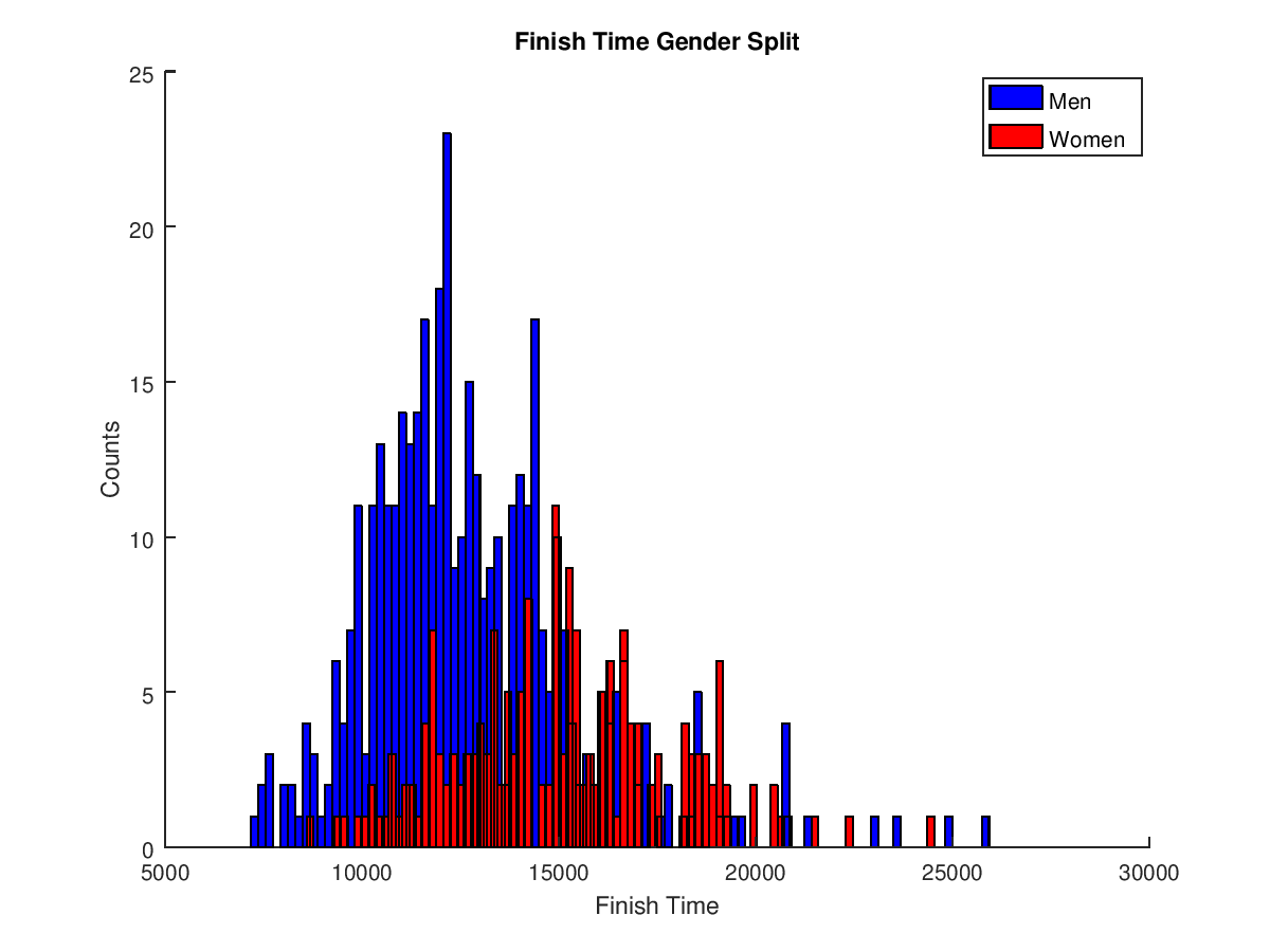
The plot shows two bell-curves, one for each gender, so it looks like the data is OK. The file used to generate this is gender_plot.m
Wave Prediction Accuracy
I was interested in seeing if the prediction for the start wave reflected the finish times, e.g. how many people also finished “within their wave”.
I decided to plot this as a line graph, however both A and B waves were combined into one, (i.e. wave 1 is both 1A and 1B) because the plot became too crowded with 12 lines.
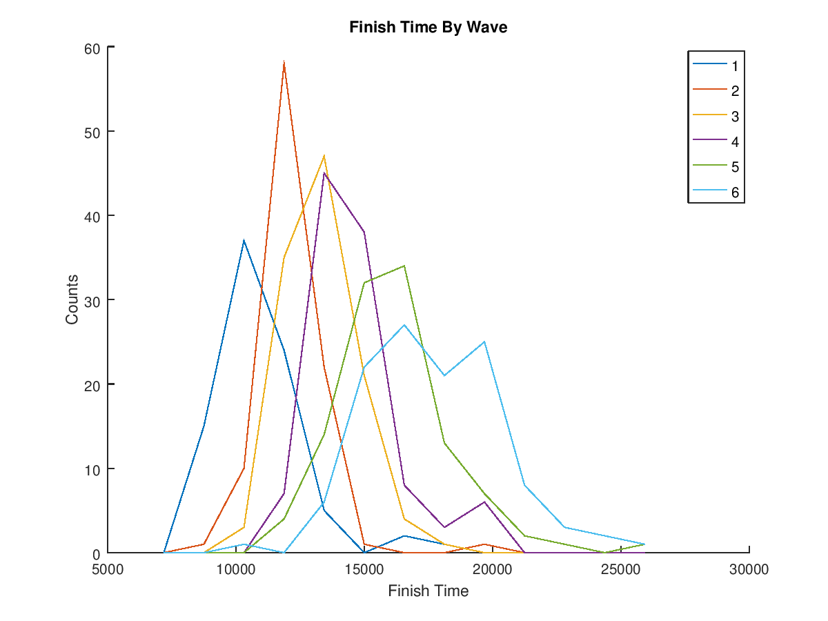
So it seems that The Goat organisers have done a good job at wave grouping, you can see the finish times seem to match the start waves, although there are definitely some overlaps. Overall the data still follows a bell curve.
I also wanted to see how many people had “beat their wave”, so I took the median time of each of the 12 waves, then filtered by those in waves that had started later but beat the median time of an earlier wave. For example, the median time for wave 1A was 9526 seconds, so anyone in wave 1B or later who finished in a faster time than this had beat their wave.
The results were output like this:
Wave 1A mean: 9526.000000 (of 42 entries)
Wave 1A mean beaten by 10 in later waves
Wave 1B mean: 10323.000000 (of 42 entries)
Wave 1B mean beaten by 15 in later waves
Wave 2A mean: 10956.500000 (of 46 entries)
Wave 2A mean beaten by 25 in later waves
Wave 2B mean: 11365.000000 (of 47 entries)
Wave 2B mean beaten by 22 in later waves
Wave 3A mean: 11883.000000 (of 53 entries)
Wave 3A mean beaten by 25 in later waves
Wave 3B mean: 12731.500000 (of 60 entries)
Wave 3B mean beaten by 41 in later waves
Wave 4A mean: 12960.000000 (of 54 entries)
Wave 4A mean beaten by 24 in later waves
Wave 4B mean: 13959.000000 (of 53 entries)
Wave 4B mean beaten by 36 in later waves
Wave 5A mean: 14631.000000 (of 57 entries)
Wave 5A mean beaten by 35 in later waves
Wave 5B mean: 15340.000000 (of 51 entries)
Wave 5B mean beaten by 35 in later waves
Wave 6A mean: 16184.500000 (of 64 entries)
Wave 6A mean beaten by 15 in later waves
Wave 6B mean: 18236.500000 (of 52 entries)
Wave 6B mean beaten by 0 in later waves
Scanning through the data it looks like it could be another bell curve of people beating their waves, but I haven’t plotted this. Also the bib numbers of those that beat their wave could easily be printed out, but that is a lot of data. The file that generates the plots and this output is wave_analyse.m.
There is a lot more analysis that could be done, such as plotting based on finish times by division. You could also make a list to show those whose absolute finish time was ahead of their wave (because waves start four minutes apart, you could have beat someone in the prior wave by three minutes, but your clock finish time would still be one minute after them). But those are questions for another day.
Predicting Finish Times Using Linear Regression
Using machine learning techniques, it should be possible to predict the finish time of a runner. Since the results predicted a finish time based on the time of the arrival at the hut and the road, I thought I’d be able to do the same. I decided to just use the time to the hut and finish time as training data for the linear regression model. In the next figure, I have plotted this data, as well as the linear regression trendline that the model generated.
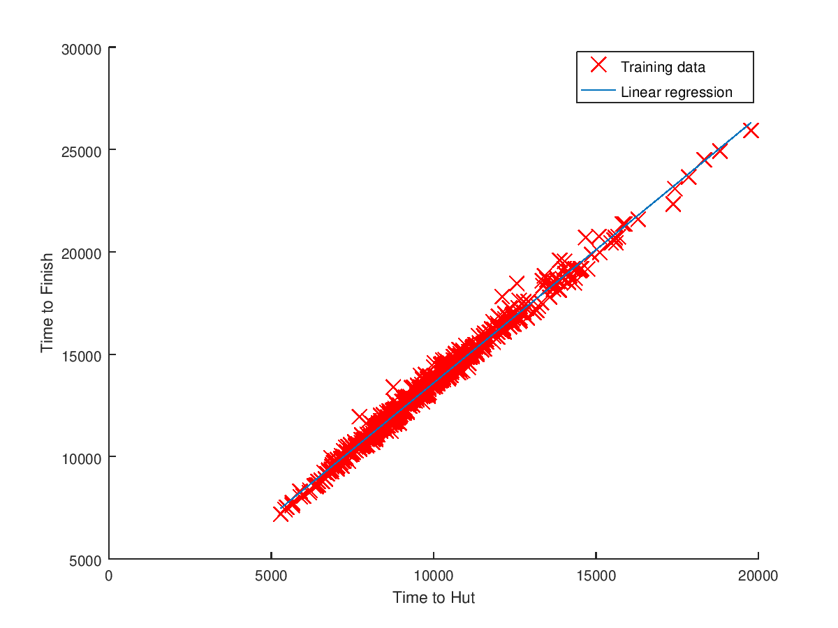
This data follows a very linear format, as you would expect with the times being on the same day and relatively close together, so the predictor should be good. I took a few samples at random from the CSV and ran them through the predictor to check the accuracy of my model.
Expected finish time for 13592: 18268.679605 (actual 18314, diff 45.320395)
Expected finish time for 5884: 8242.528418 (actual 8306, diff 63.471582)
Expected finish time for 12444: 16775.423045 (actual 16741, diff -34.423045)
Expected finish time for 9602: 13078.702538 (actual 13393, diff 314.297462)
So some were good, with 90 seconds either way, however mine (the last one) was well off, with over five minutes difference. While the model works well for a lot of cases, it obviously doesn’t know if someone has “hit the wall” before the last big climb up the waterfall. The file that generates the plots and this output is predict_finish_from_hut_time.m.
Predicting Finish Times Using Previous Times
One final prediction I wanted to try was predicting finish time using a competitors best previous time on the race (if they had one). The plot of previous best time to 2017 time, and linear regression trendline is below.
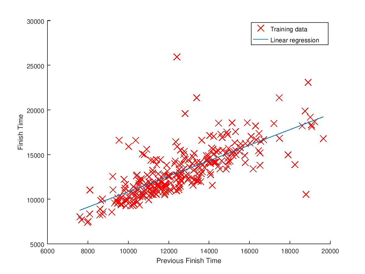
The plot for this data is all over the place, and there could be many reasons for this. If someone’s best time was ten years ago, then they might have slowed down a lot since then. Or, the conditions on the day they did the best time might have been significantly better than 2017. Maybe knowing which year their best year was from, or having a list of previous times would allow building a more accurate predictor. Taking some random samples from the CSV show the predictor is not very good at all:
Expected finish time for 5892: 7278.762851 (actual 8030, diff 751.237149)
Expected finish time for 10760: 11504.848847 (actual 14297, diff 2792.151153)
Expected finish time for 9185: 10137.534664 (actual 12849, diff 2711.465336)
Expected finish time for 8615: 9642.697150 (actual 11813, diff 2170.302850)
Some of these difference beings nearly 50 minutes. The file that generates the plots and this output is predict_finish_from_previous_time.m.
Conclusion
For those wanting to play along at home, the code is on GitHub. I feel like there is so much more that could be analysed from this, depending on how far you wanted to take it, but as a couple-hour project while resting those tired legs, I’m pretty happy with the results I got, and it has answered most of the data-nerd questions I was thinking up while out in the freezing alpine rain.